IDCaptureConstruction
Creating a shared experience across four construction products
Design SystemProduct DesignUX
Powerling is a multilingual content company founded in 1998, handling translation, localization, transcreation and digital services in more than 120 languages, with offices across Europe and the United States.
Branding
Web Design
2026
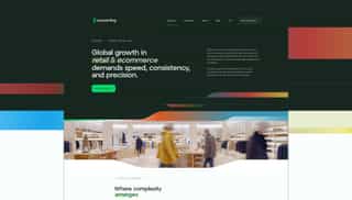
Powerling was growing through acquisitions, with new companies and new products to absorb. Restructuring the positioning and the go-to-market came with it. The website no longer reflected that shift: it presented a translation agency, while the company was building platforms, automations and AI solutions.
Start from wireframes to fix the structure against existing content, then design everything as templates so twenty pages stay consistent. Add a visual system the brand kit did not cover, shapes and flag-based gradients that say something about moving between languages, and hand the Webflow team a file where every state is already decided.
 Figma
Figma Claude Code
 Midjourney
 After Effects
 Lottie
 Fabien PlanBFractional CMO
 Sacha NoCodeFactoryWebflow developer
I started with wireframes to map the existing content against the new positioning, spot what was missing, and decide what had to be rewritten rather than moved.
Wireframes of every page template, in site order

Home page

Data & IA page
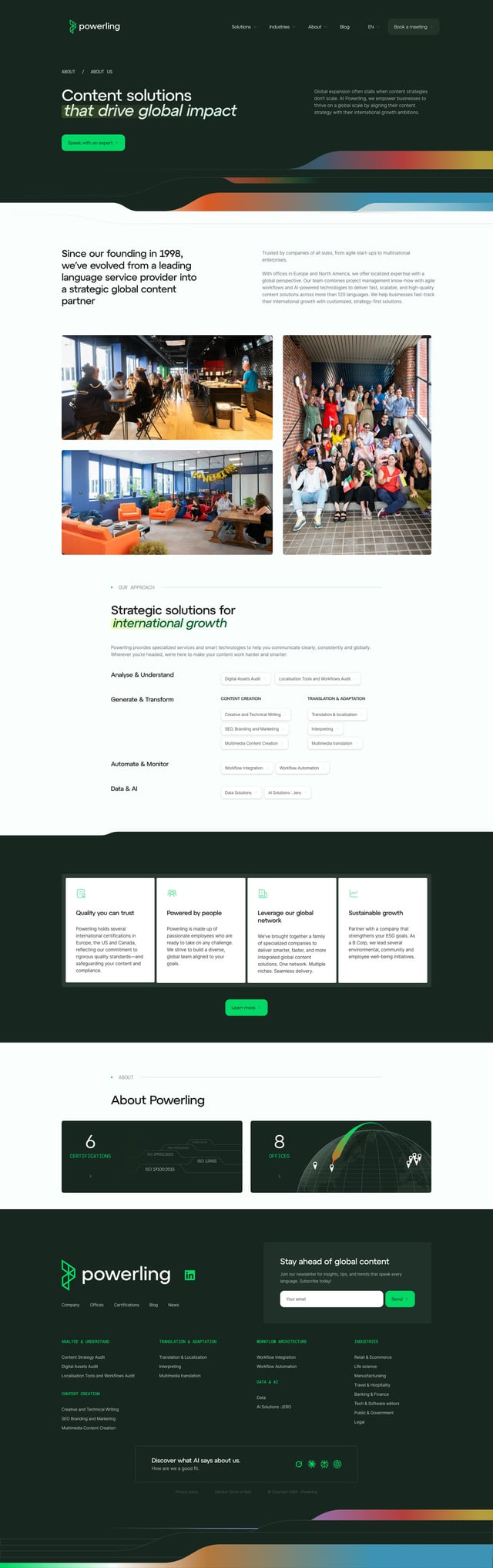
About page

Industry hub
Data & AI section
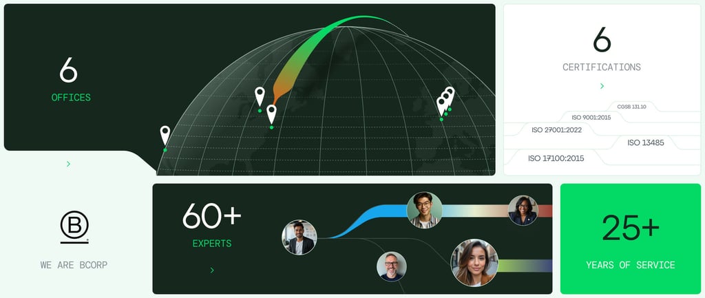
Offices, certifications and experts
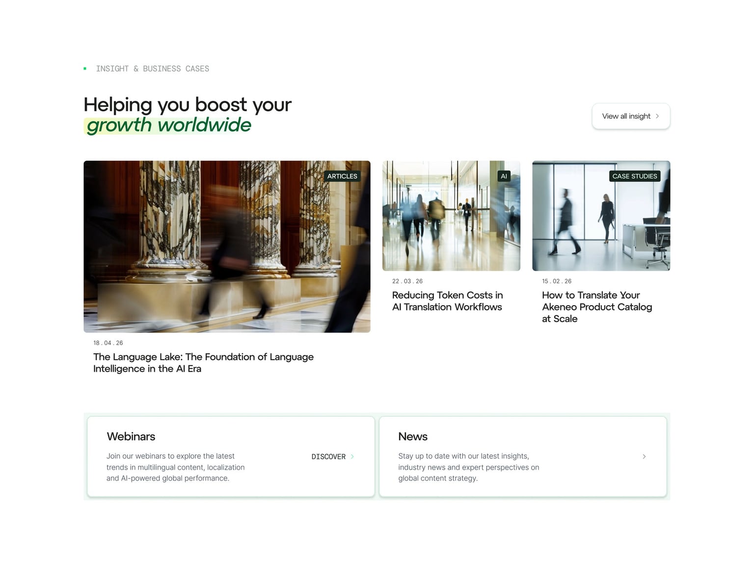
Blog and business cases
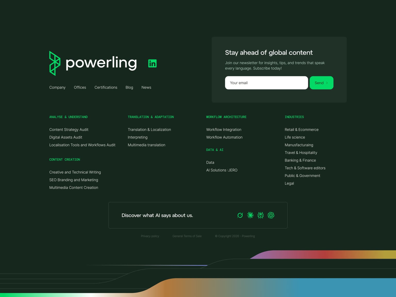
Footer
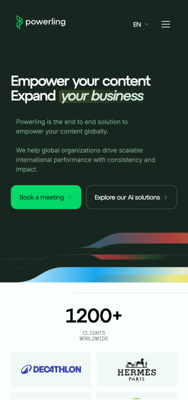
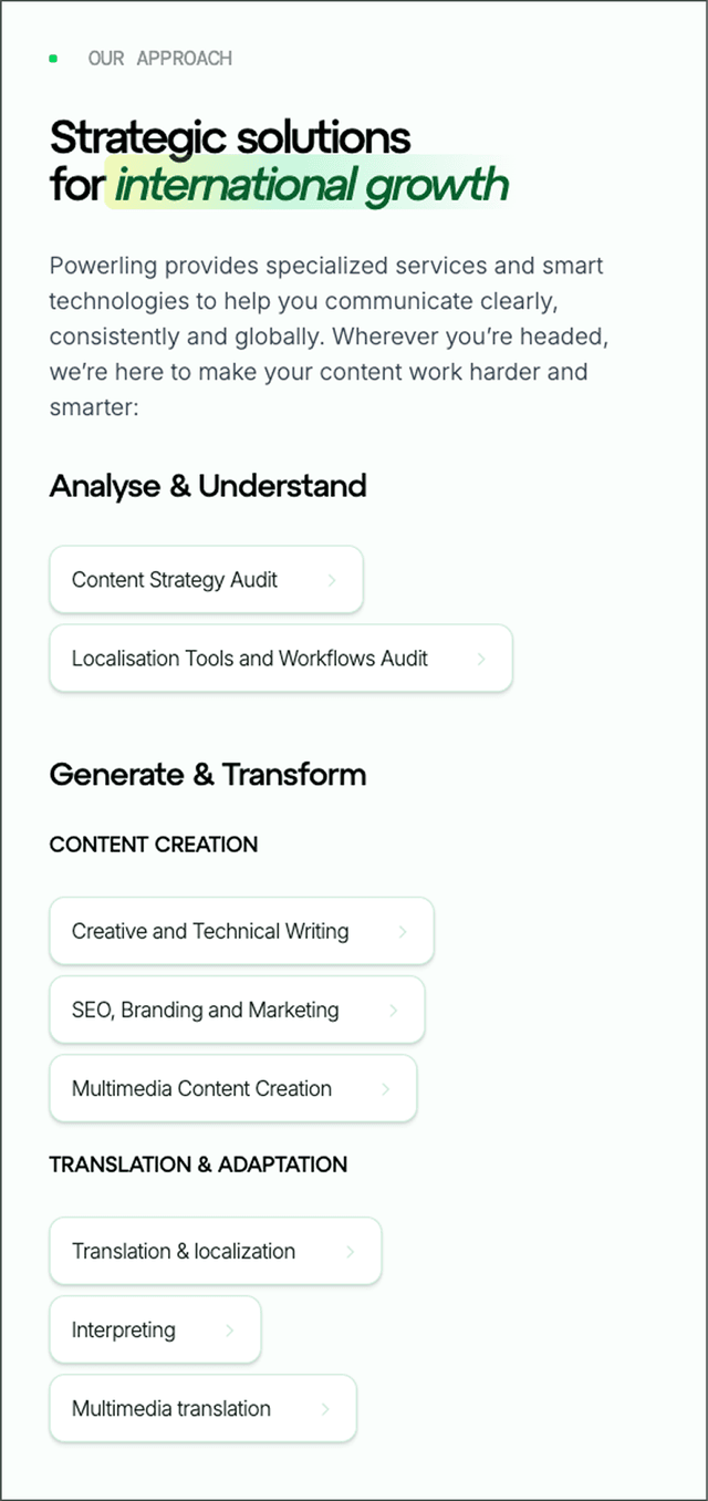

Mobile templates
A logo had been chosen before I arrived, and the colors and typefaces followed from it. What the site needed was movement: a shape I could repeat from one section to the next to give it rhythm and identity, and that said something about what the company actually does. So the work went into combining a form and a set of colors.
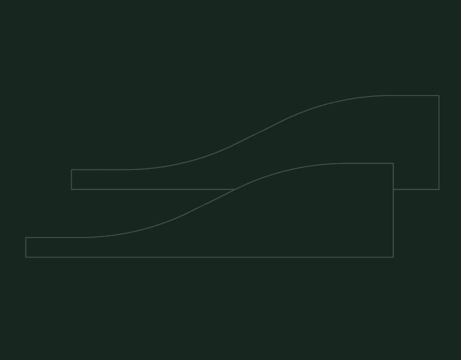
Content starts as one flat line, then gets translated and replicated across languages. The line widens: the content is amplified.
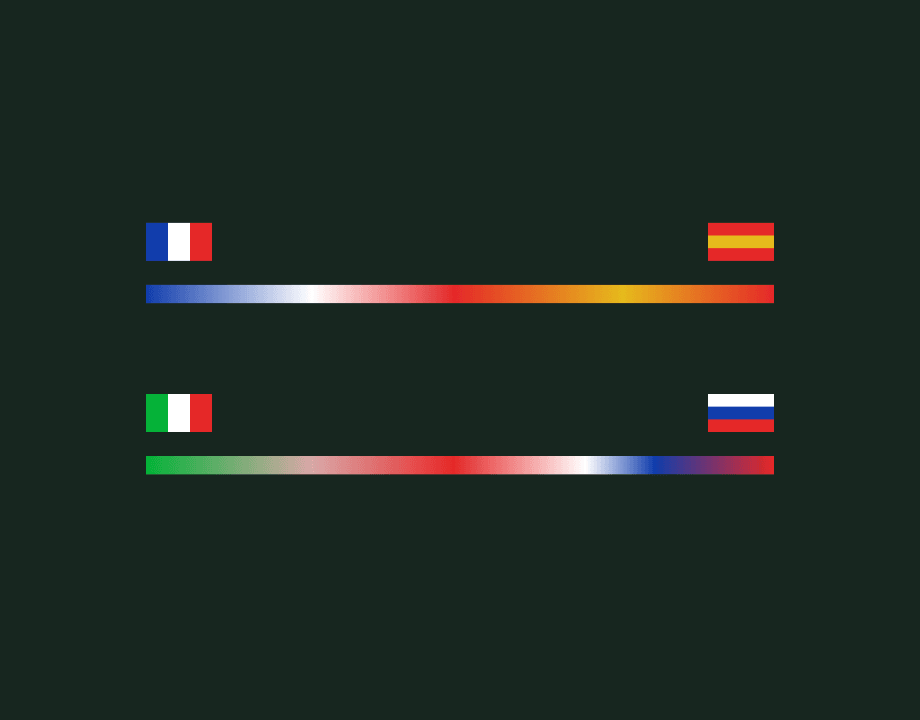
Each gradient is a transition between flag colours, one language crossing into another.
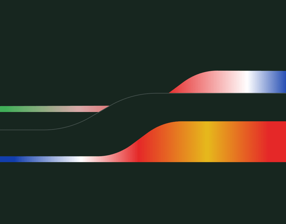
The wave filled with the gradient gives the shape declined across the whole site.
Curve editor built to help generate the shapes
The shapes and gradients did not stop at the site. I carried them over to the material the sales team uses to communicate, LinkedIn visuals and a one-pager, and documented the system in a short brand book.
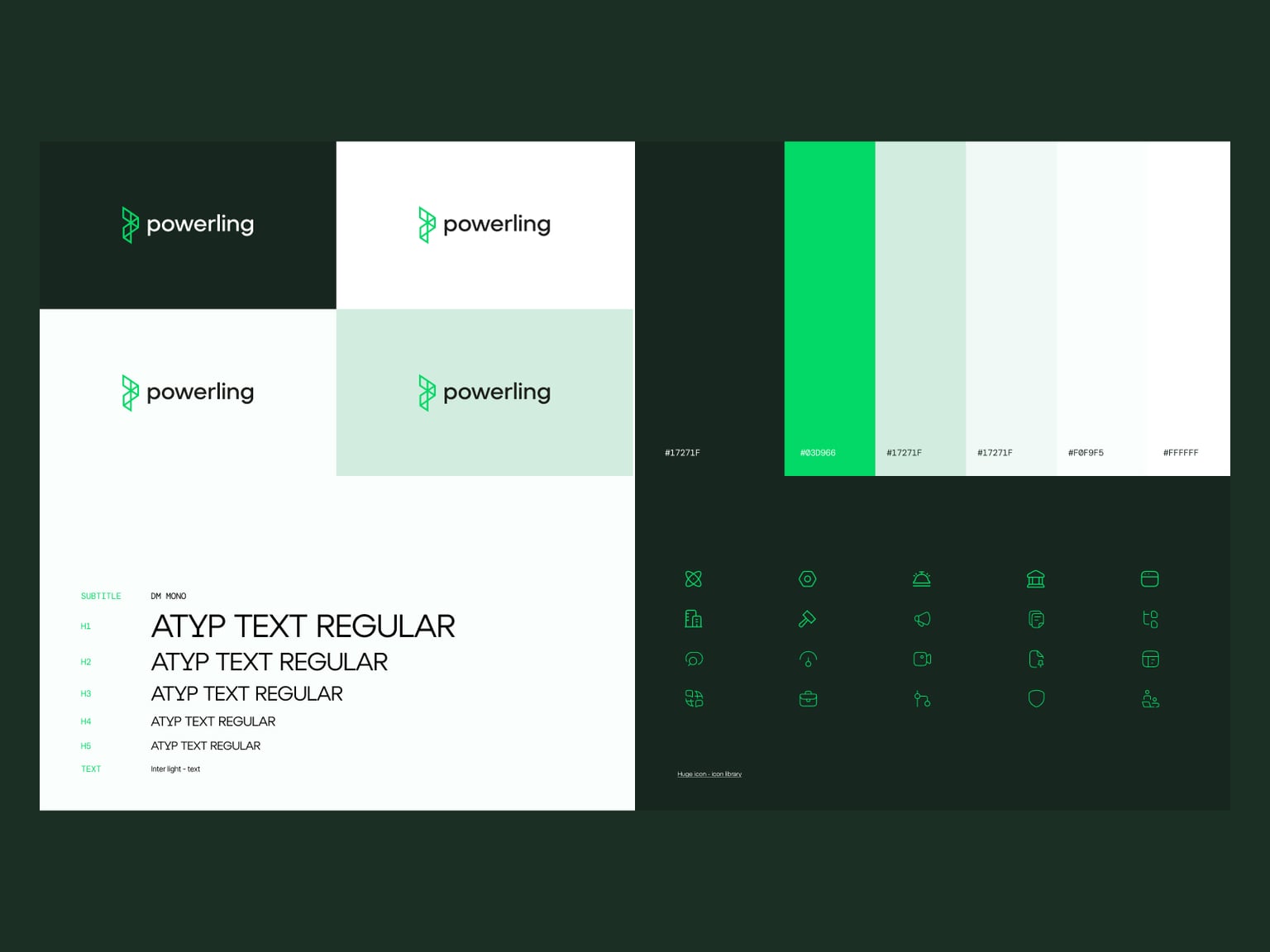
Brand book handed over with the designs
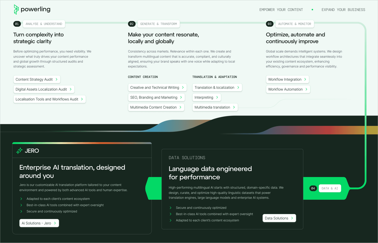
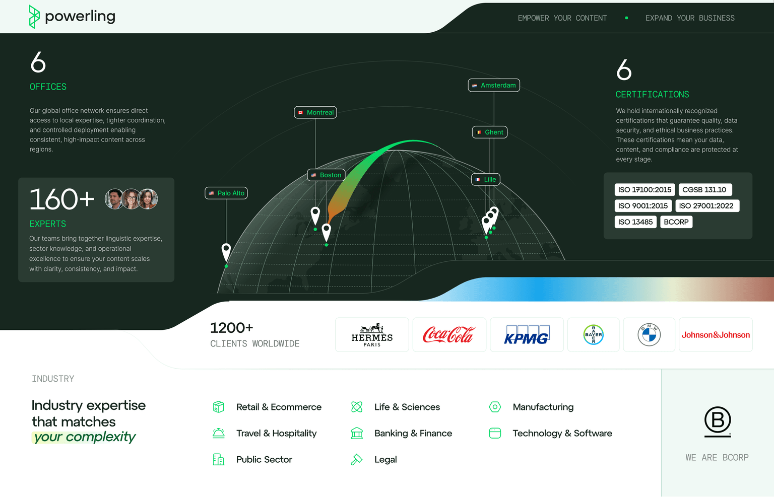
Sales one-pager
This is exactly what I need !
Let's talk